
According to that unimpeachable source, Wikipedia, Mark Twain popularized the saying in Chapters from My Autobiography, published in the North American Review in 1906.
“Figures often beguile me particularly when I have the arranging of them myself; in which case the remark attributed to Disraeli would often apply with justice and force: ‘There are three kinds of lies: lies, damned lies, and statistics.”
However, there is no record of Benjamin Disraeli ever uttering or writing these words, so maybe Twain himself was a damned liar. Perhaps we should give him the benefit of the doubt for he surely beguiled us with his witticisms.
Statistics when misused may cause more harm than lies and damned lies. Nations go to war over their abuse and millions may succumb. Dangerous political agendas derive much of their influence from cleverly disguised distortions and obscure interpretations of data. We are too often deceived, hoodwinked, and fleeced by clever manipulators of numbers who desire to take us down a road of their choosing.
Enter the world of economics and particularly the supposedly terrible calamity called income inequality. Sounds like something really bad doesn’t it? It is presented to us as if it were something we should avoid or at least strive to minimize. After all, our nation was founded on a principle of equality, wasn’t it? Not really, but I’ll leave the careful analysis of the Declaration of Independence to a future discussion.
Today, I’m twisted into an emotional knot by a headline and the caption on a chart, thanks to Bloomberg BusinessWeek Online and author Mark Glassman in an article published last November 7, 2013, and yes, I’m behind in my reading.
The headline states, Income Inequality Study: Upper Middle Class Stagnates. The caption over the key chart says, An Upper-Middle-Class Crisis. Here is the chart as it appeared in the article.

Okay, the author wants us to believe that a group of people he labels “upper-middle-class” is having a crisis, because their incomes did not increase appreciably over a twenty-year period ending in 2008. There are so many things wrong with this statement, that it is difficult to know where to begin. Here are some things you should notice about this chart.
- The chart describes world incomes, not incomes in the United States, and we don’t know the population it describes. The study was conducted by Branko Miloanovic and Christopher Lakner for the World Bank, so we might assume it was a study of the member countries of that organization.
- The height of the bars represents the percent that income in each group changed over a twenty-year period, not the percent that income changed for any individuals or even any groups of individuals. It is important to realize that the same individuals are not necessarily in each group over that time period, and in fact, it is unlikely that an individual would remain in the same group over that span of time.
- Grouping incomes into lower, middle, and upper levels represents an arbitrary classification scheme. The authors chose to label all incomes below the 45th percentile as lower incomes. They grouped incomes from the 45th percentile to the 85th percentile as middle incomes. Finally, the incomes above the 85th percentile were considered upper incomes.
- Income levels and social classes are not the same thing. Furthermore, the wealthy and affluent may have incomes in the middle or even the lower percentile groups as defined in this study, depending upon how they structure their wealth and manage their expenses.
- The distribution of incomes is not statistically normal. The extremely high incomes of a small percentage of people skews the distribution making the interpretation of the chart very difficult, perhaps impossible.
Is it a crisis that income levels between the 75th and 95th percentile of incomes didn’t change very much between 1988 and 2008? Is this a crisis for the members of society that we call the upper-middle class? The answer to both questions is no! In fact, the study did not consider how much the incomes of individuals or those in the upper-middle class changed over that 20 year period. A person who might have had an income level at the 75th percentile in 1988, might have an income in the 95th percentile or possibly the 5th percentile in 2008. The study has nothing to do with how much incomes of individuals changed, or what social classes they might be assigned.
Using the categories defined in the article, I calculated the income changes for the lower, middle and upper income groups. (See below.)
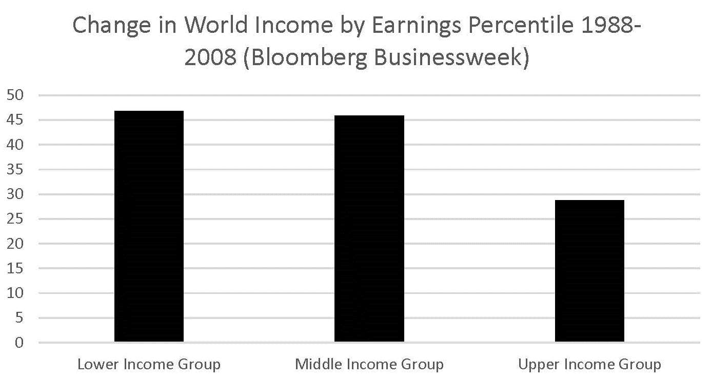
The average incomes of the lower income group increased 47 percent while the average incomes of the middle income group increased 46 percent between 1988 and 2008. This income change is about 2 percent per year. During the same period, average incomes of the upper income group increased 29 percent which is about 1.3 percent per year. Again, remember that the same individuals are not necessarily in the same group over the 20 year period. Many of the individuals who were in the lower income group in 1988 are most likely in the middle or upper income group in 2008, and their incomes have changed considerably. The study did not address this circumstance.
What would the same population look like if the categories were defined differently? For example, I calculated the average income change for each group if the lower, middle, and upper income groups were defined as the lower third, middle third, and upper third of income levels respectively. (See below.)
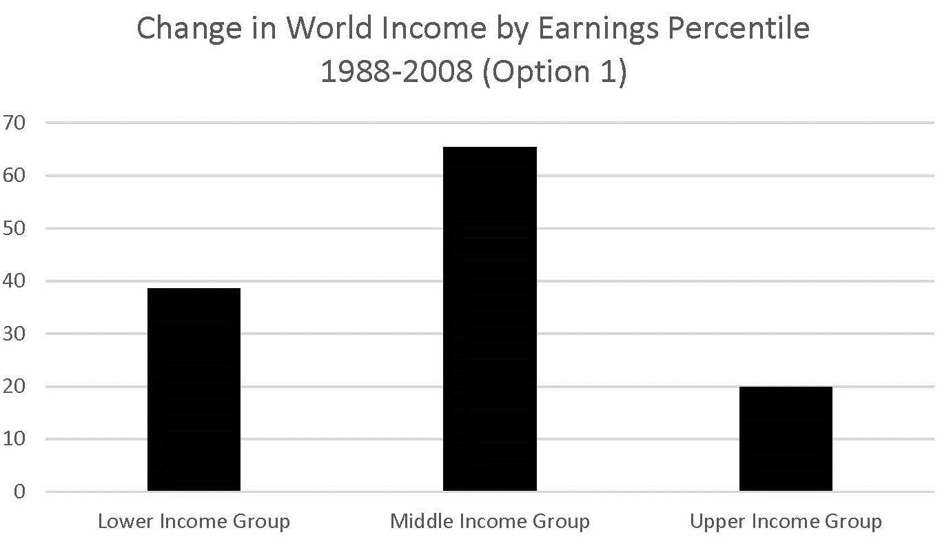
As this illustrates, the change in world income by group depends on how you define each group. The lower third of income levels only increased about 39 percent, the middle third by 65 percent, and the upper third by only 20 percent. Now where is the crisis, if there is one?
When people first become employed, their incomes are likely among the lowest percentiles of income levels, perhaps even less than minimum wage. Over a 45 to 55 year working life, their incomes generally increase as they change jobs, gain experience, and further their education and training. Upon retirement, their incomes often drop, but they may have accumulated some assets and enjoy fewer expenses. But this is only a generalization. How incomes change, how they are distributed within any population, and how they vary in different jobs and careers is far more complex than this study indicates. And the authors were engaged in nothing more than statistical tomfoolery when they proclaimed a crisis.
It turns out that income inequality is really a good thing! It means you have an opportunity to increase your income, and your lot in life, as you gain experience, seek further education, and pursue career opportunities that match your skills. Equality of opportunity is all we can expect.
Lies, damn lies, and statistics!
